【誓言】鼠标滑过CSS3渐隐渐显效果
2014-09-09 14:11:06
- 本帖最后由 誓言芜罪 于 2014-9-9 18:48 编辑
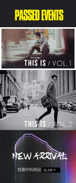
效果预览图
效果预览地址(底部)http://506896079.taobao.com
鼠标滑过图片渐隐渐显效果!
淘宝天猫通用,已经添加了C店天猫的class名
注意要改偏移left的值!
PS:CSS部分的代码复制到导航CSS里面,HTML部分复制到自定义模块。
代码如下:
css部分
[code].shiyan_css3 .shiyan_1 {
left: 0;
opacity: 0;
top: 0;
}
.shiyan_css3 .shiyan_2 {
left: -100%;
opacity: 0;
top: 100px;
}
.shiyan_css3 .shiyan_3 {
left: 600px;
opacity: 0;
top: -894px;
}
.shiyan_css3 .shiyan_4 {
left: 100%;
opacity: 0;
top: 100px;
}
.shiyan_css3:hover .shiyan_1 {
opacity: 1;
}
.shiyan_css3:hover .shiyan_2 {
left: 315px;
opacity: 1;
}
.shiyan_css3:hover .shiyan_3 {
opacity: 1;
top: 50px;
}
.shiyan_css3:hover .shiyan_4 {
left: 1340px;
opacity: 1;
}
[/code]
HTML部分
[hide][code]
[/code]
[/hide]
猜你喜欢
-

2767
3
0
关闭
-

7172
2
2
-

12149
23
89


 粤公网安备 44030902001796号 粤ICP备19041343号-3


 签到成功
签到成功
 誓言芜罪
誓言芜罪
全部评论()